Process Mapping & Business Analysis Tools
BA Academy — self-paced module
By the end of this module, you will be able to:
- Map a current-state business process, analyze it, and design a realistic future state
- Read and create process maps using standard flowchart symbols and Universal Process Notation (UPN)
- Run a value analysis to separate value-added steps from waste
- Find root causes with the 5 Whys and prioritize fixes with a Risk/Frequency grid
- Use swim lanes, the Critical Path Method, and takt/cycle time to analyze complex processes
- Choose appropriate mapping tools and facilitate a mapping workshop that stakeholders trust
The BA's Native Language
If Module 4's user stories are how a BA writes, process maps are how a BA draws. A business process map is a visual representation of how work actually happens: the steps, who does what, the decisions, and how success is measured. If a picture is worth a thousand words, a good process map is worth ten thousand, because it gets every stakeholder aligned on a shared picture of reality and forms the baseline for every improvement that follows.
Process mapping matters to your career for a blunt reason: analysis comes before architecture. A well-documented process leads to better requirements with less ambiguity, less rework, higher adoption, and better-informed system design. Mapping is frequently the very first thing a BA does on a new project.
The Core Equation: Current State, Future State, Gaps
Everything in this module hangs on one simple piece of math:
Future State − Current State = Gaps and Barriers
- The current state is how the process works now, in unvarnished reality.
- The future state is how it should work.
- The difference between them is the set of gaps and barriers, and solutions exist to close those gaps.
A detailed current-state and future-state assessment with client stakeholders defines the situation, quantifies its impact, and points directly at what the solution must do. This assessment is not optional overhead: skipping it is how teams end up automating a broken process, which just produces broken results faster.
Process Mapping Is a Language
Like any language, mapping has a vocabulary. The core symbols you will use and encounter:
- Start and stop points: what triggers the process, and what signals it is finished
- Process steps: the actions, each described with a verb phrase
- Decision points: yes/no branches where the flow splits
- Direction arrows: the path from step to step
- Problem markers: flags for waste, obstacles, barriers, bottlenecks, and variation (our source material playfully calls these "kapowies": the places where the process gets hit)
- Solution ideas: captured where they occur, so good thoughts are not lost mid-workshop
Diagramming tools add specialized symbols you should recognize on sight: predefined process (a sub-process defined elsewhere), delay, document (and multiple documents), manual input, and database. You do not need to memorize every symbol in your tool's palette; you do need the discipline of using symbols consistently so your maps read unambiguously.
Universal Process Notation (UPN)
There are many ways to document a process: flowcharts, Unified Modeling Language (UML) diagrams, value stream maps, SIPOC, and Business Process Model and Notation (BPMN), whose user manual runs to 538 pages. This course, like Salesforce's own BA training, leans on something simpler: Universal Process Notation (UPN), a clean, engaging notation designed to be understood by every stakeholder, proven across two decades in everything from regulated industries to small nonprofits. It is not proprietary and requires no specialized software.
A process mapped in UPN answers, at a glance: who needs to do what, when, why, and how?
The Elements of a UPN Diagram
- Activity box: each box is labeled with a verb phrase ("Resolve support request," not "Support")
- Resource tag: each box names who does the work, tagged with their responsibility using a RASIC-style code: Responsible, Accountable, Supporting, Informed, Consulted. (You may also see this called a RACI chart; RASIC adds the Supporting role to capture people who help without owning the task. This course uses RASIC throughout; Module 16 covers it fully.)
- Line with text: every connecting line carries a label describing the handoff between steps ("quote accepted," "data incomplete")
- Decision: rather than a diamond symbol, several labeled lines leaving one activity box represent the decision, which keeps diagrams tight
- Attachment: a paperclip marks supporting documents, metadata, or metrics attached in context
- Drill down: a marked corner on an activity box means a lower-level diagram details that step
The Five Principles of UPN
- No more than 8 to 10 activity boxes on a screen
- Drill down from an activity box to a lower level to describe detail
- Attach supporting information to an activity box
- Viewing and editing are controlled by access rights
- Version control and change history exist at the diagram level
The first two principles work together and are the genius of the approach: because a UPN map is a hierarchy of diagrams, every individual diagram stays readable at 8 to 10 boxes while the full map can describe a process of any complexity. There is no limit to how many levels you can descend. Lower-level diagrams change frequently, driven by grassroots improvements; top-level diagrams change slowly, driven by major innovation. The process map becomes the living, version-controlled operational definition of the business.
A Drill-Down in Practice
Picture a solar-equipment manufacturer mapping its Lead to Revenue process:
- Level 1 shows the whole journey in ten boxes: progress lead, run campaign, sell to customer, forecast revenue, raise and accept quote, confirm order, ship product, raise invoice, raise payment, book revenue. Each box names its resource (account executive, marketing admin, finance admin, manufacturing, the customer) and most boxes carry a drill-down marker.
- Level 2 drills into the "Progress lead" box: how a lead is created, qualified, and progressed. The scope of this diagram is set by the inputs and outputs of the box above it.
- Level 3 drills into "Create lead," down at the level of concrete, actionable detail.
How many levels should you go? As deep as needed for the diagram to be actionable by the people doing the work, and no deeper. The test: can someone use the lowest-level diagram to actually perform or improve the step? In the real world, every step gets validated in a live workshop with stakeholders; assumptions you make at the desk never survive contact with the people who do the job.
Define a Process by Input and Outcome, Not by Application
A subtle mindset shift separates strong process thinkers from tool-centric ones: a business process is defined by its input and its outcome, not by the application it runs in. Salesforce screens rarely cover the entirety of a process; manual activities and other applications drive plenty of day-to-day work. You are not designing a better application; you are designing a better business outcome.
| Process Name | Input | Outcome |
|---|---|---|
| Lead to Revenue | A lead qualified by marketing | Revenue booked into accounts receivable |
| Quote to Revenue | A quote requested by a customer | Revenue booked into accounts receivable |
| Hire to Retire | An open role in an organization | An employee's last day at the organization |
| Lead to Opportunity | A lead qualified by marketing | An opportunity qualified by sales |
| Inquiry to Close Case | A customer support case is opened | The case is closed |
| Recruit to Day One | A new employee is hired | The employee completes their first day |
Agreeing on input and outcome sounds trivial and is not. For "Lead to Revenue," expect stakeholders to argue: What is a lead: someone about to purchase (sales' definition) or someone who registered for an event (marketing's)? What counts as revenue: a signed contract, a raised invoice, or cash in the bank? Settling these definitions is real analysis work, and once settled, the input and outcome define the scope of every drill-down level below.
One practical tip: lead-to-revenue-sized processes are politically loaded and stakeholder-heavy. If your organization is new to mapping, demonstrate value first on a simpler, lower-stakes process, ideally one that is low risk but high visibility.
The Mapping Methodology
A reliable seven-step sequence for any mapping effort:
- Identify the process to map. Pick something underperforming or customer-facing. Name it (by input and outcome).
- Create the right team. The people who use the process are the experts. Include those who manage the process and those who live in it daily.
- Gather the necessary information. Where does the process begin and end? What steps happen in between? What are the inputs and outputs? Who does what, and when?
- Develop the map. Order the steps from beginning to end and draw.
- Analyze the map. Scrutinize for inefficiencies, bottlenecks, and removable steps.
- Develop improved steps. Implement improvements on a small scale first; scale what works.
- Manage the process. Monitor the improved process and keep optimizing.
And the best practices that keep the methodology honest:
- Map the whole current state before fixing anything. Define the "as-is" completely so changes are informed by the whole picture, not the loudest symptom.
- Validate maps with stakeholders immediately after drawing them. An unvalidated map is a hypothesis wearing a diagram's clothes.
- Set clear start and end points early to limit scope, and review intersecting secondary processes, because inefficiencies often live at the seams.
- Watch out for the "most responsive stakeholder" trap. It is tempting to build the map from the two people who answer your emails fastest. The quiet stakeholders often own the steps you most need to understand.
- Learn the customer's business terminology and use it on the map. A map in the client's own language gets validated; a map in consultant-speak gets politely ignored.
Facilitating the Mapping Workshop
Current-state mapping is usually done live, with stickies (physical or virtual), and the facilitation pattern matters:
- Pin down the official start and stop first.
- Map the happy path: the easiest, cleanest route from start to stop, in every gritty step.
- Go back through and capture branches and workarounds, official and unofficial. The unofficial ones are gold: they are the process telling you where it hurts.
- As you go, add markers for waste, bottlenecks, unnecessary waiting, lost information, broken communication, dead ends, safety concerns, and regulatory concerns.
- Capture solution ideas as they arise, parked to one side, so the group stays in mapping mode without losing insights.
The goal is the "down and dirty" real current state. A sanitized map of how the process is supposed to work protects nobody; the real one, warts and all, is fixable.
Measuring the Process: Attributes and True North
A current-state map should carry an attributes table: tangible measurements and intangible findings that characterize the process. For a retail example: frustrated customers waiting on out-of-stock products; competitors taking market share; 30 percent of products returned due to defects; 75 percent of stores needing technology training.
Organize measurable attributes against the four True North metrics of process perfection:
| Pillar | Metric (example) | Current (example) | True North Goal |
|---|---|---|---|
| Quality | Product returns | 30% | Zero defects |
| Cost | Delivery cost | $10 shipping per order | 0% waste, 100% value |
| Delivery / Timeliness | Product delivery time | 3 weeks | 100% on-time, zero delays |
| Human Development | Stores needing tech training | 75% | 100% engaged and capable |
Perfection is unattainable; that is not the point. As coach Vince Lombardi put it: "Perfection is not attainable. But if we chase perfection, we can catch excellence." True North gives every improvement conversation a fixed compass heading, and the attributes table gives you the baseline you will measure improvement against (remember Module 1's benchmarking habit).
Value Analysis: Green, Yellow, Red
Here is the sharpest analytical knife in this module. Value is always determined by the customer of the process, whether that customer is external (a buyer) or internal (the next team downstream). Value analysis walks the map step by step and sorts every step into three colors:
- Green: Value-Added. The step generates value from the receiver's perspective: something the customer would miss (or pay for) if it vanished. Keep it, perfect it.
- Yellow: Non-Value-Added but Necessary. No value to the receiver, but the process cannot legally or practically exist without it (compliance checks, regulated documentation).
- Red: Non-Value-Added. No value to the receiver and not required. Waste.
The facilitation rule that makes this work: assume every step is Red first. The team must argue a step up to Yellow (with the regulating document on hand for review) or Green (with consensus that the receiver actually seeks this from the process). Defaulting to Red flips the burden of proof and stops the room from rubber-stamping the status quo.
A concrete example: a clinic visit mapped as Enter, Check in, Verify ID, Have a seat, Nurse takes vitals, Walk to room, See provider, Exit. Value analysis asks what the patient actually came for (seeing the provider) and what could collapse: the future state might be Enter, Check in, Verify ID, Provider takes vitals in-room, Exit. Shortening the time between start and finish increases the flow of value to the customer by eliminating waste: waiting rooms, redundant walking, handoffs.
Root Cause Analysis: The 5 Whys
Problems on your map are usually symptoms. The 5 Whys technique digs to the root by asking "why?" at least five times, each answer becoming the next question. The classic worked example:
Problem: the Lincoln Memorial's limestone columns are getting damaged.
- Why? Maintenance crews pressure-wash them with strong chemicals.
- Why? The stone is covered in bird droppings.
- Why? Birds feed on the insects at the memorial at night.
- Why? Swarms of insects gather near the memorial.
- Why? They are attracted to the bright security lights at night.
Root cause: the lights. Solution: use less insect-attractive lighting and install timers. Notice what the technique prevented: without it, the "obvious" fixes are gentler chemicals or more frequent washing, both of which treat the symptom forever at ongoing cost. Once the root cause is identified, solutions can prevent the problem from recurring rather than managing it in perpetuity.
Prioritizing Root Causes: The Risk/Frequency Grid
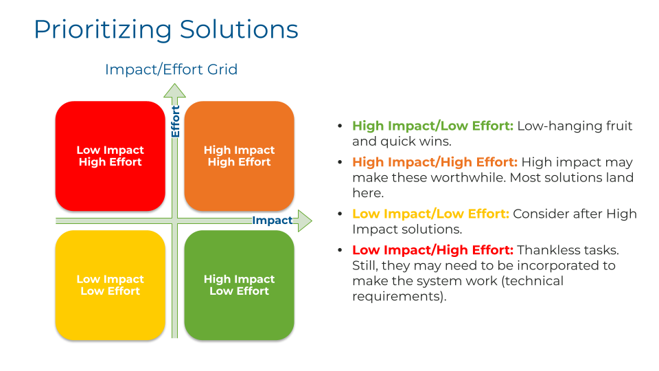
Real processes yield more root causes than any project can fix. To prioritize, facilitate a Risk/Frequency grid: a chart with Risk (low to high) on one axis and Frequency (low to high) on the other, forming four quadrants. Place each gap or barrier as a team:
- High risk / high frequency: detrimental when it occurs, and it occurs constantly. Fix these first.
- High risk / low frequency: detrimental but rare. Mitigate and monitor (contingency plans live here).
- Low risk / high frequency: minor disturbance, constant drumbeat. Often cheap wins that buy goodwill.
- Low risk / low frequency: minor and rare. Fix last, if ever.
The grid conversation is as valuable as the grid: stakeholders discover they disagree about how risky or frequent an issue really is, and resolving that disagreement with data is analysis in its purest form.
Prioritizing Solutions: Risk/Frequency Grid
The Ideal State Exercise
Before designing the future state, run a deliberately unconstrained thought experiment: the Ideal State. Imagine the process with no constraints at all: every step delivers immediate value to the customer, zero waste, complete fulfillment for everyone involved. Enter, magic happens, exit. The perfect state.
This feels frivolous and is not. Teams that skip straight to "realistic" future states anchor on the current process and merely trim it. Teams that imagine the ideal first often discover that entire chunks of the process exist only by habit, and their realistic future state lands much closer to excellent. Dream first, then constrain.
Future State Mapping
Now design the realistic target. The Future State map should be as close to the Ideal State as possible within the constraints of the project and organization. The rules:
- Use the same start and end triggers as the current state, so improvement is measurable like-for-like.
- Carry over Green steps that are working perfectly, watching how any reordering affects their value.
- Carry over Yellow (regulated) steps: changing a law, policy, or handbook is usually outside project scope. If the governing document can actually be changed during the effort, add that to the solution list instead.
- Carry over a Red step only if reordering it, or the improvement of another step, turns it Green or Yellow. Otherwise, Red steps do not survive.
Done well, the future state contains only value-added and regulated steps: the maximum possible value flowing to the customer within real-world constraints. The delta between your current and future state maps, quantified by your attributes table, becomes the business case and the requirements backbone for the whole project.
Swim Lane Diagrams
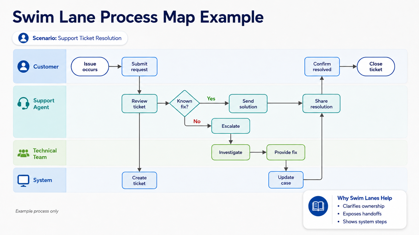
When a process crosses multiple people, teams, or departments, add swim lanes: horizontal (or vertical) bands that assign each step to the party responsible for it. Swim lane diagrams visually distinguish responsibilities for sub-processes, making complex, multi-stakeholder processes dramatically more readable and exposing every handoff.
Handoffs deserve special attention: they are where processes drop things. Every time the flow crosses a lane boundary, ask: how does the next party learn the work is ready? What information travels with it? What happens when it stalls? As a BA, swim lanes are invaluable for facilitating discussions about process improvement and organizational change, because they make the who unmistakable.
Swim Lane Process Map
Critical Path Method
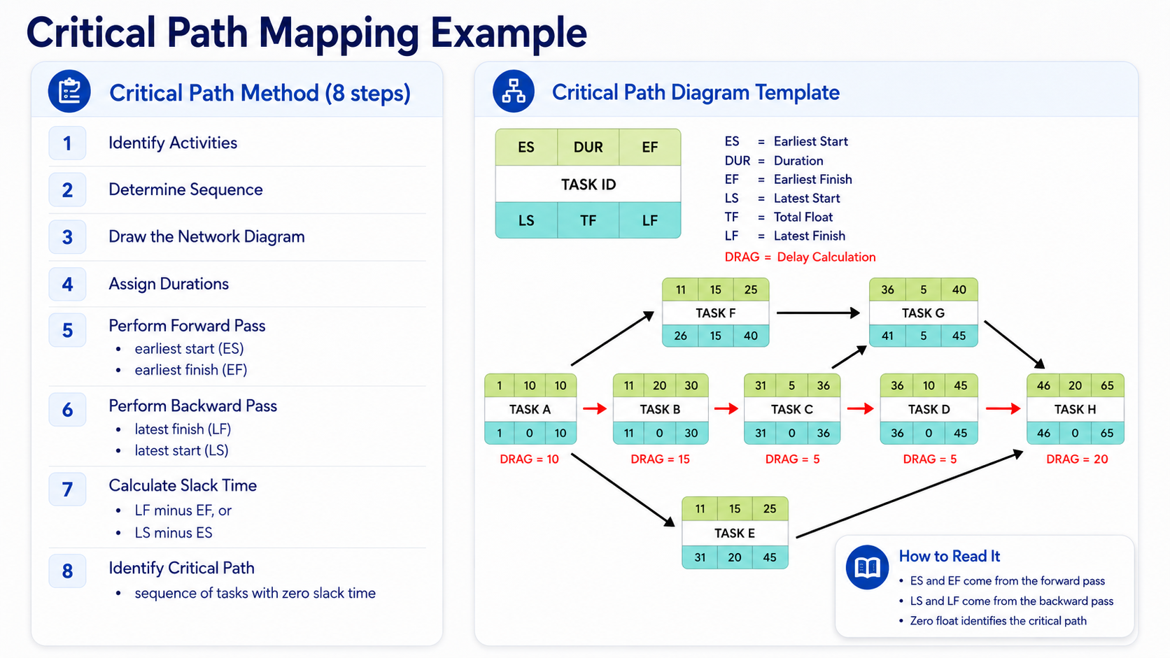
The Critical Path Method (CPM) comes from project management, but BAs use it to understand which tasks in a process or project determine the overall timeline. It identifies critical tasks, sequences activities, uncovers dependencies and interrelationships, and optimizes the schedule.
The eight steps:
- Identify activities: list every task required.
- Determine sequence: which tasks depend on which; which can run concurrently.
- Draw the network diagram: tasks as nodes, arrows showing dependencies.
- Assign durations to each task.
- Perform the forward pass: starting from the first task, calculate each task's earliest start (ES) and earliest finish (EF). The first task's ES is 0; each subsequent task's ES is the EF of the task it depends on, and its EF is its ES plus its duration.
- Perform the backward pass: starting from the last task, calculate latest finish (LF) and latest start (LS). The last task's LF equals its EF; each preceding task's LF is the LS of its successor, and its LS is its LF minus its duration.
- Calculate slack: LF minus EF (or LS minus ES) for each task: how long it can slip without delaying the whole.
- Identify the critical path: the sequence of tasks with zero slack. This is the shortest possible completion time, and any delay on this path delays everything.
Why a BA cares: when stakeholders ask "what happens if data migration slips a week?", the critical path answers precisely. Tasks on the path get protected; tasks with slack provide flexibility. It transforms schedule conversations from vibes to math.
Critical Path Mapping
Takt Time and Cycle Time
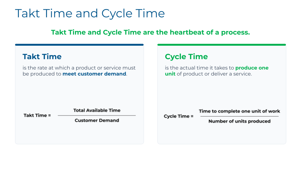
Two Lean measurements form "the heartbeat of a process":
- Takt time is the rate at which a product or service must be produced to meet customer demand: total available production time divided by units demanded. If a factory operates 8 hours a day and must produce 100 units daily, takt time is 4.8 minutes per unit. One unit must come off the line every 4.8 minutes to keep pace with demand.
- Cycle time is the actual time it takes to produce one unit or deliver one service, end to end.
The goal is to bring cycle time as close as possible to takt time: demand met on time, with an efficient process and no wasteful overcapacity. If cycle time exceeds takt time, you fall behind demand (queues, delays, overtime). In service contexts the same logic applies: if your support team receives 40 cases per 8-hour day, takt time is 12 minutes per case; if resolving a case actually takes 30 minutes of touch time, the gap tells you exactly how much capacity, automation, or process improvement you need.
Takt Time vs. Cycle Time
Other Diagrams Worth Knowing
UPN maps carry the detail, but several companion diagrams appear constantly alongside them:
- Capability model: an industry blueprint listing high-level process areas. Useful for scoping which area you are mapping and showing its context within the whole business.
- Detailed process map: a full flowchart drill-down of one process with every step and decision point documented.
- SIPOC: Suppliers, Inputs, Process, Outputs, Customers. Ideal for identifying a process's key elements before detailed mapping, and for defining the scope of a complex process. (You will meet SIPOC again in Module 16's stakeholder work.)
- Value stream map: visualizes the flow of material and information needed to bring a product to a customer, with measurements of inputs and outputs at each step. The tool of choice for finding waste within and between processes.
You will also encounter diagram-design guidance worth adopting: aim for the "3 Cs" of clarity, consistency, and contrast in any diagram you publish, and remember that Salesforce publishes reference-architecture diagram galleries you can adapt rather than starting from blank canvases.
Choosing Tools
Start free: whiteboards, stickies, and general diagramming tools are enough while you learn. When evaluating dedicated software (Lucidchart, Visio, Miro, and similar), the criteria that matter:
- Drag-and-drop interface for quick map creation
- Formatting capabilities that support proper notation
- Security and versioning: processes are valuable assets; control who can change them and keep history
- Publishing and sharing: web-based tools make cross-team sharing painless
- Intuitive design, especially while your team's mapping experience is young
The tool is the least important decision in this module. A great map in a humble tool beats a mediocre map in an expensive one, every time.
Key Takeaways
- Future State minus Current State equals the gaps and barriers your project exists to close. Map reality first; fix second.
- UPN keeps maps readable at any complexity: verb-phrase activity boxes, RASIC-tagged resources, labeled handoff lines, attachments, and unlimited drill-down, never more than 8 to 10 boxes per screen.
- Define processes by input and outcome, not by application. Getting stakeholders to agree on those definitions is real analysis.
- Map the happy path first, then branches and workarounds; capture problems and ideas as you go; validate everything live with stakeholders.
- Measure against True North (quality, cost, timeliness, human development), sort steps Green/Yellow/Red with the customer defining value, find roots with 5 Whys, and prioritize on the Risk/Frequency grid.
- Dream the Ideal State before drawing the Future State, then carry over only what earns its place.
- Swim lanes expose handoffs; CPM exposes the schedule's skeleton; takt versus cycle time exposes the capacity gap.
- Tools are secondary. Notation discipline, stakeholder validation, and honest current states are what make maps trustworthy.
Knowledge Check
8 questions. Answer at your own pace, then check the explanation for each.
Module 5 complete
Nice work. Review any question again using the menu (top right), or move on.